

Creating a cohesive and visually appealing Webflow site starts with a well-defined style guide. This guide will help you maintain consistency across your project, ensuring a seamless user experience. Here’s a breakdown of the core elements you need to get started:
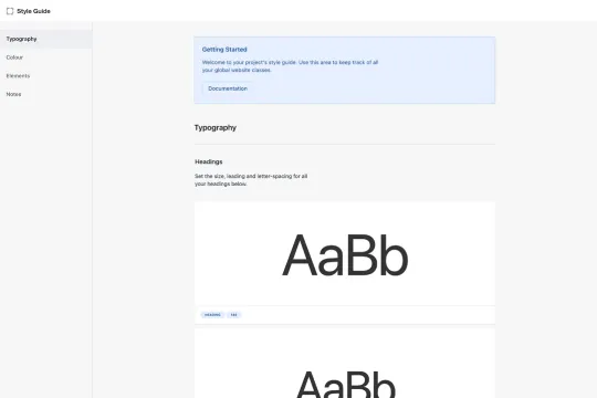
Typography Settings
Headings
- H1, H2, H3, H4, H5, H6: Define your hierarchy with distinct font sizes, weights, and line heights.
Text Classes
- Body Text: Standardize your paragraphs with consistent font size, weight, and line height.
- Labels/Eyebrows: Use smaller, uppercase text for section labels or introductory text.
- Field Labels: Ensure form labels are clear and readable.
- Rich Text: Style your rich text elements for blog posts or content-heavy sections.
Color Options
Text Colors
- Primary, Secondary, Tertiary: Define a palette for your main text, subtext, and additional text elements.
- Text Hovers: Add hover effects to enhance interactivity.
Fill Colors
- Backgrounds: Set primary and secondary background colors for different sections.
- Border Colors: Define border colors for elements like cards and containers.
Form Colors
- Input Fields: Style your form fields for both light and dark versions to ensure readability and accessibility.
Elements
Buttons
- Primary, Secondary, Tertiary: Differentiate actions with distinct button styles.
- Icon Buttons: Combine icons with buttons for a modern touch.
- Submit Buttons: Ensure your form submission buttons stand out.
Links
- Text Links: Style your hyperlinks for clarity.
- Inline Links: Use inline links within paragraphs for a seamless look.
Interface Elements
- Pills: Use pill-shaped elements for tags or categories.
- Icons: Standardize your interface icons for consistency.
Form Elements
- Text Fields, Text Areas: Style your input fields for usability.
- Checkboxes, Radio Buttons: Ensure these elements are easily clickable.
- Select Fields, Dropdowns: Style your dropdown menus for a polished look.
Containers and Spacers
- Containers: Define your content width and padding.
- Spacers: Use spacers to maintain consistent spacing between elements.
Additional Information
This style guide serves as a foundational tool for your Webflow site, ensuring that every element is thoughtfully designed and consistent. By adhering to these guidelines, you’ll create a cohesive and professional web presence that enhances user experience and engagement.
---
By following this style guide, you’ll be well on your way to creating a visually appealing and user-friendly Webflow site. Happy designing!
Creating a cohesive and visually appealing Webflow site starts with a well-defined style guide. This guide will help you maintain consistency across your project, ensuring a seamless user experience. Here’s a breakdown of the core elements you need to get started:
Typography Settings
Headings
- H1, H2, H3, H4, H5, H6: Define your hierarchy with distinct font sizes, weights, and line heights.
Text Classes
- Body Text: Standardize your paragraphs with consistent font size, weight, and line height.
- Labels/Eyebrows: Use smaller, uppercase text for section labels or introductory text.
- Field Labels: Ensure form labels are clear and readable.
- Rich Text: Style your rich text elements for blog posts or content-heavy sections.
Color Options
Text Colors
- Primary, Secondary, Tertiary: Define a palette for your main text, subtext, and additional text elements.
- Text Hovers: Add hover effects to enhance interactivity.
Fill Colors
- Backgrounds: Set primary and secondary background colors for different sections.
- Border Colors: Define border colors for elements like cards and containers.
Form Colors
- Input Fields: Style your form fields for both light and dark versions to ensure readability and accessibility.
Elements
Buttons
- Primary, Secondary, Tertiary: Differentiate actions with distinct button styles.
- Icon Buttons: Combine icons with buttons for a modern touch.
- Submit Buttons: Ensure your form submission buttons stand out.
Links
- Text Links: Style your hyperlinks for clarity.
- Inline Links: Use inline links within paragraphs for a seamless look.
Interface Elements
- Pills: Use pill-shaped elements for tags or categories.
- Icons: Standardize your interface icons for consistency.
Form Elements
- Text Fields, Text Areas: Style your input fields for usability.
- Checkboxes, Radio Buttons: Ensure these elements are easily clickable.
- Select Fields, Dropdowns: Style your dropdown menus for a polished look.
Containers and Spacers
- Containers: Define your content width and padding.
- Spacers: Use spacers to maintain consistent spacing between elements.
Additional Information
This style guide serves as a foundational tool for your Webflow site, ensuring that every element is thoughtfully designed and consistent. By adhering to these guidelines, you’ll create a cohesive and professional web presence that enhances user experience and engagement.
---
By following this style guide, you’ll be well on your way to creating a visually appealing and user-friendly Webflow site. Happy designing!


